Logo update at Fruit of the Loom

Published on 15.03.2023
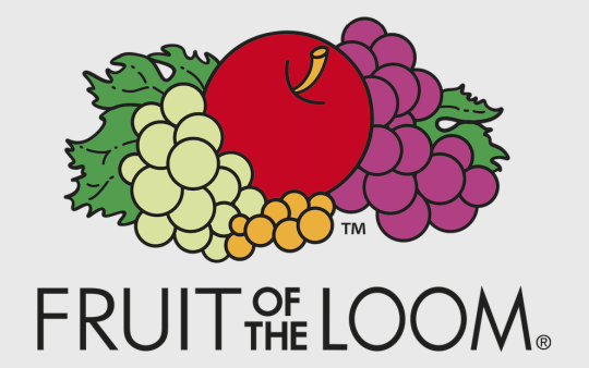
Fruit of the Loom gives its well-known fruit logo a modern update: by omitting the shading and highlights, the logo gets a fresh, clean look in a 2D design. The redesign of the logo stands for the rejuvenation of the brand and represents the traditional brand heritage in terms of quality, (colour) diversity and modern styles for all ages. While the familiar arrangement of the fruit remains the same, the logo now emits a clean look thanks to the removal of the shading and highlights. These minor changes make the logo colours appear brighter and the contours thinner. With the subtle design changes, Fruit of the Loom is keeping its finger on the pulse of the time and underlining the brand’s efforts to stay attractive for a younger target audience.
The colourful brand history of Fruit of the Loom
Since its creation, the colourful Fruit of the Loom logo has stood for the tradition-rich history of the brand and its diversity: founded in 1851 by the brothers Benjamin and Robert Knight, the two Americans opened their first factory shortly afterwards and started producing cotton fabrics as well as textiles in Warwick, Rhode Island. Just under 20 years later, it was registered as an official trademark. This makes Fruit of the Loom one of the oldest trademarks. The colourful product range and brand name have been reflected in the iconic fruit logo since the beginning. It has been adapted from time to time over the years, but has never lost its unmistakeable look. Today, Fruit of the Loom is a real cult brand and an established player on the global textile market. Furthermore, for years now the company has put special importance on manufacturing its textiles in an ethical and eco-friendly way.
The logo element that never was
The juicy red apple, berries in various colours and rich, green leaves – those are the components that make up the iconic Fruit of the Loom logo. However, there is actually another element that keeps on being associated with the brand logo: the cornucopia. What is this all about? This misconception is caused by something called the “Mandela Effect”. This is a phenomenon where people fill in gaps in their memory with freely invented elements – although these false memories never existed. This is also the case with the Fruit of the Loom logo: on the internet, you can still find a number of articles and images of the logo depicting a cornucopia. In reality, this has never been part of the Fruit of the Loom logo.
The new Fruit of the Loom logo has been in use on all of the brand’s channels since January 2023.


